

Showing posts with label artist's books. Show all posts
Showing posts with label artist's books. Show all posts
Tuesday, January 5, 2016
How Many Muses?

Thursday, November 5, 2015

Thursday, October 15, 2015
DPC @ VA/BF
 The Drift Plain Collective is representing once again this weekend, as they bring a bunch of chapbooks, zines, broadsides, and prints to the 2015 Vancouver Art/Book Fair. They'll have copies of RUNX TALES and Catholics on hand, as well as some spectacular books and ephemera by Elizabeth Boyne, Karen Carcia, Cody Gieselman, Kimberly Maher, Elizabeth Munger, Kalmia Strong, and more. A culmination of Vancouver's Artists' Book Week, the Vancouver Art/Book Fair is hosted October 17–18 by Project Space, and is free and open to the public.
Wednesday, October 7, 2015
October shows featuring Catholics

Thursday, September 10, 2015
Fragmentation is the rule

But still, they remain separate, text on one page, image on another. There is a power, though, in turning that page and seeing the other side of the coin. Haptic agency connects two divergent ways of receiving information. My zine-making background causes me to privilege the chimerical results of collage: no matter how certain it seems that two scraps belong together, tactile cues identify them as separate entities. The places in between (between pages, between scraps) are where things get really exciting, where you can peer into the gaps between artifact and story. Fragmentation is the rule—a dictate that’s not so radical, really: the separation of text and image characterizes what is often dismissed as that most conventional genre, the livre d’artiste.

 The book's prose sections are the origin points for exploring a range of subjects including Catholic-Masonic tensions, the fervency of converts, the legacy of the Legion of Decency, and the spiritual significance of revelatory shrouds. They relate my religious upbringing as they join with the book’s images to braid several themes: Church history, pre-Christian mythology, and the places where such spiritualities resonate with twentieth-century pop culture. In Catholics, text and image, the sacred and profane, the humorous and tragic, the zine and literary fine-press all end up as strange bedfellows in desperate need of confession.
You can learn more about Catholics here!
Sunday, July 26, 2015
Catch Your Breath
The baroqueness of my new artist's book, Catholics, is at times overwhelming. It uses letterpress-printed typography to build images; references Joan Crawford, Tallulah Bankhead, and Carl Jung in its theatrical illustrations; and draws inspiration from sixth-century souvenirs in its collaged eulogiae.
In order to allow the reader some relief from the denser sections of prose and imagery, I also included interludes. There are two types: chthonic and eremitic.

The chthonic invokes sacred traditions associated with the underworld.

And the eremitic conjures the Christian custom of engaging with the desert as a site of spiritual seeking.
The interludes' backgrounds are letterpress printed from photopolymer plate halftones—the chthonic from a scan of crumpled flax paper made by Cave, the eremitic from stone-textured spray paint. Their text is printed from varyingly letterspaced Centaur metal type.
Catholics is influenced by twentieth-century cinema, both in theme and content. I wanted the interludes to act like the long-abandoned practice of offering an intermission in the middle of a movie, a chance to reflect and review what you've seen so far. Click here to learn more about the book.
In order to allow the reader some relief from the denser sections of prose and imagery, I also included interludes. There are two types: chthonic and eremitic.

The chthonic invokes sacred traditions associated with the underworld.

And the eremitic conjures the Christian custom of engaging with the desert as a site of spiritual seeking.
The interludes' backgrounds are letterpress printed from photopolymer plate halftones—the chthonic from a scan of crumpled flax paper made by Cave, the eremitic from stone-textured spray paint. Their text is printed from varyingly letterspaced Centaur metal type.
Catholics is influenced by twentieth-century cinema, both in theme and content. I wanted the interludes to act like the long-abandoned practice of offering an intermission in the middle of a movie, a chance to reflect and review what you've seen so far. Click here to learn more about the book.
Sunday, July 12, 2015
... a Eucharistic dust jacket that wends along a desert wind ...
That’s me, I must have thought somewhere just beyond myself, a thought like a Eucharistic dust that wends along a desert wind. An infiltrator destined for hell. The singed flesh felt distinct.
I just finished printing a dust jacket for my new artist's book, Catholics. It was letterpress printed from photopolymer plates, except for the spine, which was printed from metal type (Goudy Text and Spartan Heavy). The front cover also features a die-cut Eucharistic wafer/solar cross, a preview of a motif that runs throughout the book.


—from Catholics
I just finished printing a dust jacket for my new artist's book, Catholics. It was letterpress printed from photopolymer plates, except for the spine, which was printed from metal type (Goudy Text and Spartan Heavy). The front cover also features a die-cut Eucharistic wafer/solar cross, a preview of a motif that runs throughout the book.


A copy of Catholics was recently acquired by the University of Iowa Libraries Special Collections. To learn more about the book, which is a limited-edition memoir told through text and image, visit my website.
Tuesday, June 30, 2015
2 New Collections
I'm excited to have my work recently acquired by two fantastic collections!
 A copy of Catholics is now at the Newberry Library. To learn more about the artist's book, which is a memoir that incorporates typography, illustration, and collage, click here.

And the Blanton Museum of Art at UT, Austin has obtained the original drawing of Shelley Long as Phyllis Nefler, created as a tribute to costume designer Theadora Van Runkle. To read more about Van Runkle and the other drawings I made in memory of her, click here.


And the Blanton Museum of Art at UT, Austin has obtained the original drawing of Shelley Long as Phyllis Nefler, created as a tribute to costume designer Theadora Van Runkle. To read more about Van Runkle and the other drawings I made in memory of her, click here.
Thursday, June 11, 2015
More Illustrations from Catholics
Here are three illustrated page spreads from my new limited-edition artist's book, Catholics. They all take place at important moments in the book's narrative arc:
 A legendary quip by Tallulah Bankhead showcases some cutting anti-clerical mockery in the book's illustrated epigraph.


And Joan Crawford's purported dying words serve as an illustrated epigraph.
To learn more about Catholics, click HERE.


A crudely transformative quote from Carl Jung precedes the book’s climax.

And Joan Crawford's purported dying words serve as an illustrated epigraph.
To learn more about Catholics, click HERE.
Friday, May 29, 2015
Catholics Goes Live
 I just finished creating a web page for my new artist's book, Catholics:
http://matt-runkle.com/catholics.html
It includes a complete description of the project, as well a GIF of the book's transmutative sequence featuring a shifting frame I composed from metal type.
Saturday, May 23, 2015
Catholic Souvenirs
Central to my new artist's book, Catholics, are its eulogiae, three portfolios that rely heavily on collage.
According to Colleen McDannell in Material Christianity, sixth-century pilgrims to sacred sites in Europe carried away tiny clay or glass ampullae that contained traces of dirt, oil, or water found at the visited shrine. Diagrammatic images of the location were also rendered on the exteriors of these souvenirs, called eulogiae. Each eulogia in Catholics attempts to conjure remembered space in a similar way: handwritten text and collaged images function as both architecture and performance.
In ‘Boys Town,’ the first eulogia, I attempt to create a papist Pleasure Island by contrasting stories of childhood sugar highs with events that reflect Church misogyny and violence.

In ‘Confessional,’ I use closet imagery and fragments of muscle mags as I mimic the rhetoric of Augustine by addressing my confessions to Joan Crawford.

And in ‘Dream Church,’ where hand-drawn illustrations start to invade, I try to spiritually rebuild by reflecting on my good fortune in meeting such a loving, inspiring, and ongoing collaborator.


To learn more about Catholics, read about its illustrated saints and images created from typographic ornaments!
According to Colleen McDannell in Material Christianity, sixth-century pilgrims to sacred sites in Europe carried away tiny clay or glass ampullae that contained traces of dirt, oil, or water found at the visited shrine. Diagrammatic images of the location were also rendered on the exteriors of these souvenirs, called eulogiae. Each eulogia in Catholics attempts to conjure remembered space in a similar way: handwritten text and collaged images function as both architecture and performance.
In ‘Boys Town,’ the first eulogia, I attempt to create a papist Pleasure Island by contrasting stories of childhood sugar highs with events that reflect Church misogyny and violence.

In ‘Confessional,’ I use closet imagery and fragments of muscle mags as I mimic the rhetoric of Augustine by addressing my confessions to Joan Crawford.

And in ‘Dream Church,’ where hand-drawn illustrations start to invade, I try to spiritually rebuild by reflecting on my good fortune in meeting such a loving, inspiring, and ongoing collaborator.


To learn more about Catholics, read about its illustrated saints and images created from typographic ornaments!
Saturday, May 16, 2015
Caxton Club Grant Presentation
 |
| Photo by Susan Hanes |
Catholics is an artist’s book, a limited-edition memoir that makes use of comics, collage, and letterpress printed typography to explore the psychic cathedral built by its author’s Catholic traditionalist upbringing. Beginning with an anti-clerical quip by Tallulah Bankhead, the book takes on a range of subjects including Catholic-Masonic tensions, the fervency of converts, the legacy of the Legion of Decency, and the spiritual significance of revelatory shrouds. In Catholics, the sacred and profane, the humorous and tragic, the zine and literary fine-press all end up as strange bedfellows in desperate need of confession.Check back for more pics of Catholics!
Wednesday, May 6, 2015
Artist's Books at Prairie Lights!
Come see my multitalented students display their artist's books from our Creative Writing for Book Arts class! Subtitled 'Writing for Visual & Material Genres', the class has explored comics, zines, typography, text + image, and hybrid genres before culminating in their final project—a book whose form is integral to its content. The event is this Saturday, May 9 from 5–7 pm at Prairie Lights Bookstore.

Friday, April 10, 2015
Catholics on Display
I'm debuting a new artist's book, Catholics, as part of my MFA thesis show at the UI Center for the Book. I'll be showing work along with Alexandra Janezic at the K. K. Merker Gallery in the basement level of North Hall from April 13–17. The reception will be from 5:30–7:30 on Friday, April 17.
4x6postcardmockup.jpg)
Both Janezic's and my work features images built and printed from metal type (see below). To learn more about Catholics, click here and here. I'll be posting more images from the book in the coming weeks.
4x6postcardmockup2.jpg)
Both Janezic's and my work features images built and printed from metal type (see below). To learn more about Catholics, click here and here. I'll be posting more images from the book in the coming weeks.
Thursday, March 19, 2015
Typographic Transfiguration
I've finished printing the content for Catholics, an artist's book I'm working on at the University of Iowa Center for the Book. It is a limited-edition memoir that relates my Catholic upbringing as it interweaves several themes: Church history, pre-Christian mythology, and the places where such spiritualities resonate with twentieth-century pop culture.
One of the book's features is a series of seven communion wafers/solar crosses. These images are surrounded by Bruce Rogers–inspired frames letterpress printed from metal typographic ornaments that alchemically shift throughout the course of the book. The wafers/solar crosses animate their own narrative, a transmuting framework that comments on the book’s other threads. I also adapted the sequence into a suite of prints.
To see a post about some of the book's hand-drawn illustrations, click here. I'm excited to start binding the edition of 25 this week. Meanwhile, check out the wafer/solar cross series below.

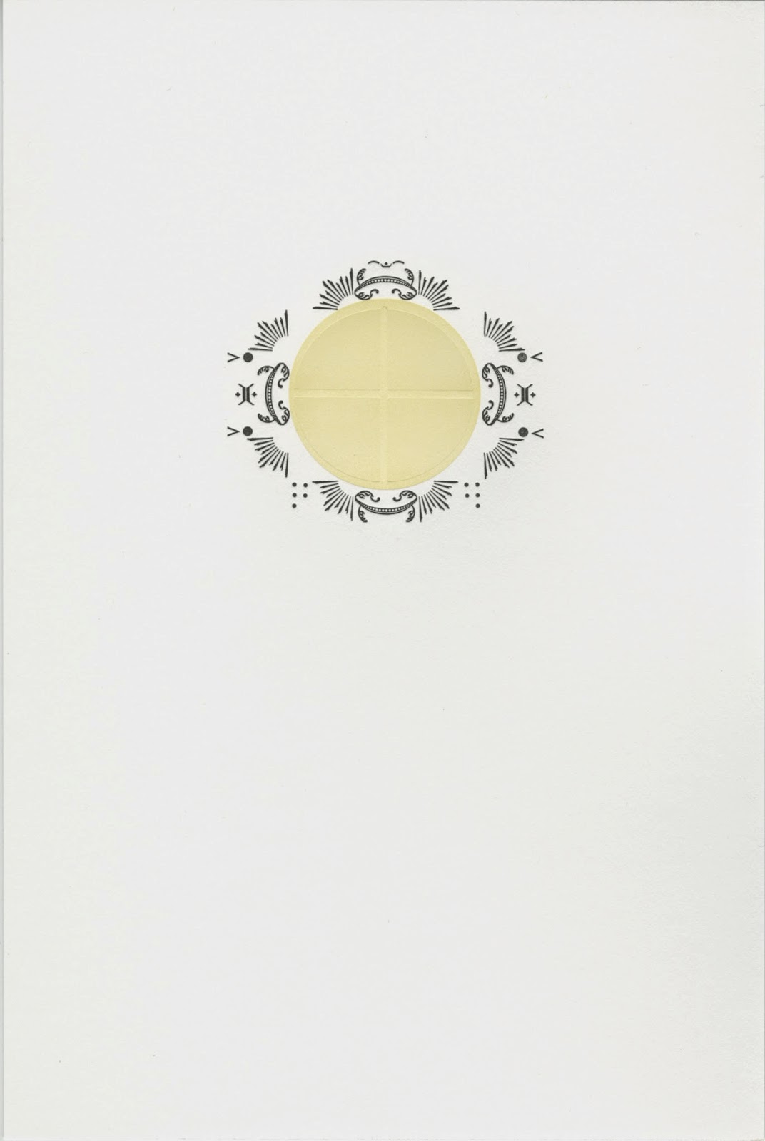


One of the book's features is a series of seven communion wafers/solar crosses. These images are surrounded by Bruce Rogers–inspired frames letterpress printed from metal typographic ornaments that alchemically shift throughout the course of the book. The wafers/solar crosses animate their own narrative, a transmuting framework that comments on the book’s other threads. I also adapted the sequence into a suite of prints.
To see a post about some of the book's hand-drawn illustrations, click here. I'm excited to start binding the edition of 25 this week. Meanwhile, check out the wafer/solar cross series below.
Sunday, February 15, 2015
Three saints for the Caxton Club
The Caxton Club is celebrating their 120th anniversary this Wednesday, Feb 18 at the Newberry Library in Chicago. The celebration will be accompanied by a pop-up exhibit featuring artists funded by the organization. Last year the Caxton Club awarded me a grant for my artist's book-in-progress, Catholics, and the exhibit will include three drawings of saints (played by Joan Crawford and Tallulah Bankhead) I made for the project. In order from top to bottom, it's Joan of Arc, Saint Veronica, and Therese of Lisieux:


Monday, September 29, 2014
5. PRIDE GOETH BEFORE
 ‘Pride Goeth Before’ is basically an altar boy memoir, as much as that’s possible—the performative nature of the role being one that lends itself better to fiction. The narrator’s rival/inspiration is an off-Broadway belter gigging as cantor whose carefully crafted femininity perturbs the congregation. An earlier version of the piece appeared in the debut issue of Mixed Fruit (check it out on page 11), and it continues to evolve. In the very first drafts of the story, the cantor’s owlness was much more explicit—she actually shape-shifted and flew around the rafters.
 Serving as an altar boy was such a formative experience, it continues to be a theme I can’t escape. I’m currently making an artist’s book called Catholics, where my bizarre altar boyhood is a major theme. Catholics won’t be done until Spring 2015, though, so meanwhile get your dose by pre-ordering The Story of How All Animals Are Equal & Other Tales HERE.
Monday, May 5, 2014
Artist's Books this Saturday at Prairie Lights
 I've been lucky to work with an exceptional group of students this semester in my Creative Writing for Book Arts class. They've been working hard on their final projects, artist's books that will be on display this Saturday night from 7 - 9 pm at Prairie Lights. Come see their work, which includes the following intriguing tag lines:
A look into Plato's cave. An epic take on the lowly shrimp. Eye-test poems. Forty thoughts from a forty-passenger tour bus. Emails from The City of Love. All this and more ...
Tuesday, April 1, 2014
A Lament (concerning dimensions)
What is A Lament? It's a unique-edition full-color flexagon zine housed in a Japanese portfolio. Digitally printed on Domestic Etching after a failed attempt at printing on cardstock, it uses collage, handwritten proclamations, and a Wizard-of-Oz color/b&w shift to explore the idea of how 'every other dimension is better than ours except for one.'


The portfolio, which includes a magnetic closure, is covered in black buckram with pastedowns featuring hand-watercoloring and pencil scrawls. The piece's zine-like composition and appearance of haphazard
construction contrast with its overbuilt case. I basically wanted it to look like a pile of trash inside a professional shell. Although not practical, it could be editioned, which
I might do in the future if there seems to be some unexpected surge of interest.

'How dining alone is a masculine act / and how Laura Riding said that "poet" is a lying word (it is a wall that closes & does not)'


'A weird, impenetrable jumble of morning glories & hedge bamboo. / Loss here is a desirable state.'

'A habitation let down from heaven on golden chains. / The sound of cicadas like a lemon being squeezed.'
A Lament was featured this last January as part of Peripheral Shifts, a UICB-focused group art show at Quad City Arts in Rock City, IL. I'm now trying to figure out how to settle its generic confusion—a non-editioned zine / an underwhelmingly crafted artist's book / a hexagonally-paneled comic / a poem interrupted by texture and color? And that ultimate question: how to make this something that's actually an accessible, readable thing here in this dimension, the one that's worst of all except one?
Wednesday, February 12, 2014
Think Kinko's
I participated in a panel last month that explored the intersection between zines and artist's books. The panel was titled Out of the Copy Machine, Into the Streets, and was included as part of the programming at the 2014 College Book Art Association Conference in Salt Lake City. I talked about the general bookishness of the work of Raymond Pettibon, and in particular, the sequencing of the drawings in his early zines. My co-presenters included Alexandra Janezic on the thematic overlap between riot grrrl zines and mass distributed women's comics, and Kalmia Strong on alternative printing techniques used in contemporary zines. The three of us collaborated on a zine where we each generated creative interpretations of our research, then mailed the zine (titled Think Kinko's) to the panel's attendees. My contribution—Pettibon-inspired, calligraphic illustrations—are below.


Subscribe to:
Posts (Atom)