

Showing posts with label memoir. Show all posts
Showing posts with label memoir. Show all posts
Thursday, November 5, 2015

Friday, October 30, 2015
Seven Deadly Prints
I just finished a 4-flap enclosure to house this suite of prints I made as a companion to Catholics. Each of the seven images is centered around a communion wafer/solar cross, which was printed with heavy impression from photopolymer plates. Surrounding this central image is a Bruce Rogers–inspired frame printed from metal typographic ornaments that alchemically shifts from print to print. The wafers/solar crosses animate a sequence that comments on narrative threads included in the artist's book, while also operating as an independent group. The suite was printed in an edition of ten, and is available either individually or paired with the book in a deluxe edition.


Wednesday, October 7, 2015
October shows featuring Catholics

Thursday, September 10, 2015
Fragmentation is the rule

But still, they remain separate, text on one page, image on another. There is a power, though, in turning that page and seeing the other side of the coin. Haptic agency connects two divergent ways of receiving information. My zine-making background causes me to privilege the chimerical results of collage: no matter how certain it seems that two scraps belong together, tactile cues identify them as separate entities. The places in between (between pages, between scraps) are where things get really exciting, where you can peer into the gaps between artifact and story. Fragmentation is the rule—a dictate that’s not so radical, really: the separation of text and image characterizes what is often dismissed as that most conventional genre, the livre d’artiste.

 The book's prose sections are the origin points for exploring a range of subjects including Catholic-Masonic tensions, the fervency of converts, the legacy of the Legion of Decency, and the spiritual significance of revelatory shrouds. They relate my religious upbringing as they join with the book’s images to braid several themes: Church history, pre-Christian mythology, and the places where such spiritualities resonate with twentieth-century pop culture. In Catholics, text and image, the sacred and profane, the humorous and tragic, the zine and literary fine-press all end up as strange bedfellows in desperate need of confession.
You can learn more about Catholics here!
Monday, August 10, 2015
Quincunx Recap
 My new artist's book, Catholics, is a memoir that's haunted by three saints, all portrayed by either Joan Crawford or Tallulah Bankhead. The saints—Joan of Arc, Saint Veronica, and Thérèse of Lisieux—are each referenced in the book's anecdotal prose pieces, and the layout of the illustrations is patterned after their prose companions' typographic design. Their layout is also inspired by the quincunx, a sacred formation where one central image is surrounded by four smaller objects at each corner. In Renaissance art, these four objects often represent aspects of the fourfold world: humors, elements, seasons, gospels, or some other system of correspondences. Robert M. Place writes in The Tarot: History, Symbolism, and Divination:
... the symbolic structure of the physical world is used to define the sacred center and frame the image of the divine presence. Buddhists place Buddha in the center of their four-sided diagrams called mandalas and Christians place Christ in the center of the cross or a mystical diagram called a quincunx (165).The World card is a Tarot image that often uses the quincunx formation; the iconic Rider-Smith-Waite version of The World depicts a dancing woman encircled by a wreath and the symbols for the four Evangelists. I also reference Pamela Colman Smith's depiction of The Tower in one of these saint illustrations and mimic the theatrical background horizon line she uses in many of her images. Place points out that Smith's experience as a theater designer influenced the performative nature of her compositions, where flat background lines often invoke stage backdrops. I wanted a similar feeling of pageantry for these saints and am grateful for Smith's inspiration.
Catholics is a project that is animist. During its creation I’ve tried to tap into the energetic potential of material objects, whether magazine scraps or metal ornaments collecting dust in inherited type cases. The tension between sacredness and profanity that plays out in the book's themes is a reflection of my process as I sought transcendence in tangible bits of detritus. Catholicism is ornately melodramatic, but it didn’t build that baroque on its own: the pagan cultures suppressed by the Church were mined for their sacred objects and images, which were then repurposed to maintain the Roman hierarchy’s power. Each of Catholics' illustrated saints was once a goddess who is now being refracted through my twentieth-century pop cultural lens.

Joan of Arc fends off childlike grotesqueries—are they specters or saints? A little bit of both, actually. As a teenager, I got a glimpse inside my local Masonic Temple when I found work dressing up as Mr. Peanut and a Campbell's Soup Kid at a Christmas party hosted there. And my childhood movie-watching habits were restricted by the National Catholic Office for Motion Pictures, who seemed to dislike campy anti-consumerist morality tales featuring bloodthirsty monsters like Gremlins and Little Shop of Horrors.

Saint Veronica contemplates icons more crass than the one she clutches: John Stamos and Brooke Shields posing for the cover of a teen Catholic propaganda magazine, and Traci Lords and Pope John Paul II as depicted on some shredded T-shirts my boyfriend referred to as shrouds.

Thérèse of Lisieux, her quincunx rotating into the back- and foregrounds, smiles an epiphanic smile. The ladybug and magpie are animals important to both Thérèse's childhood and mine. The tower in the background is in imitation of Pamela Colman Smith. The crucifix Thérèse holds recalls another saint, Brigit, who evolved out of a Celtic goddess associated with both the nocturnal owl and the solar cross. In the book's final prose section, Brigit, Thérèse, and the memory of my mother all converge to intimate a threefold deity.
More information about Catholics can be found here.
Friday, May 29, 2015
Catholics Goes Live
 I just finished creating a web page for my new artist's book, Catholics:
http://matt-runkle.com/catholics.html
It includes a complete description of the project, as well a GIF of the book's transmutative sequence featuring a shifting frame I composed from metal type.
Friday, April 10, 2015
Catholics on Display
I'm debuting a new artist's book, Catholics, as part of my MFA thesis show at the UI Center for the Book. I'll be showing work along with Alexandra Janezic at the K. K. Merker Gallery in the basement level of North Hall from April 13–17. The reception will be from 5:30–7:30 on Friday, April 17.
4x6postcardmockup.jpg)
Both Janezic's and my work features images built and printed from metal type (see below). To learn more about Catholics, click here and here. I'll be posting more images from the book in the coming weeks.
4x6postcardmockup2.jpg)
Both Janezic's and my work features images built and printed from metal type (see below). To learn more about Catholics, click here and here. I'll be posting more images from the book in the coming weeks.
Thursday, March 19, 2015
Typographic Transfiguration
I've finished printing the content for Catholics, an artist's book I'm working on at the University of Iowa Center for the Book. It is a limited-edition memoir that relates my Catholic upbringing as it interweaves several themes: Church history, pre-Christian mythology, and the places where such spiritualities resonate with twentieth-century pop culture.
One of the book's features is a series of seven communion wafers/solar crosses. These images are surrounded by Bruce Rogers–inspired frames letterpress printed from metal typographic ornaments that alchemically shift throughout the course of the book. The wafers/solar crosses animate their own narrative, a transmuting framework that comments on the book’s other threads. I also adapted the sequence into a suite of prints.
To see a post about some of the book's hand-drawn illustrations, click here. I'm excited to start binding the edition of 25 this week. Meanwhile, check out the wafer/solar cross series below.

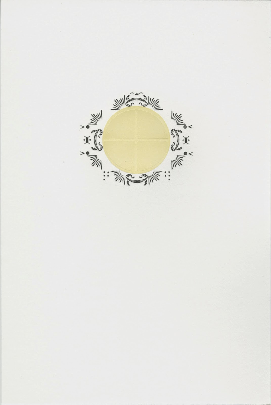


One of the book's features is a series of seven communion wafers/solar crosses. These images are surrounded by Bruce Rogers–inspired frames letterpress printed from metal typographic ornaments that alchemically shift throughout the course of the book. The wafers/solar crosses animate their own narrative, a transmuting framework that comments on the book’s other threads. I also adapted the sequence into a suite of prints.
To see a post about some of the book's hand-drawn illustrations, click here. I'm excited to start binding the edition of 25 this week. Meanwhile, check out the wafer/solar cross series below.
Subscribe to:
Posts (Atom)