Showing posts with label book art. Show all posts

Wednesday, April 6, 2016

Turning scraps into stories ...


Story Box: Creating Narrative with Relief Collage is happening at San Francisco Center for the Book next Saturday, April 16! We'll be making story boxes, shallow boxes with partitions that tell three-panel stories using 3-D collage (think Joseph Cornell!). Whether or not you're new to the book arts, if you're interested in boxmaking, visual narrative, sequential art, or collage, this workshop will be a lot of fun! Click HERE to register.

Monday, March 14, 2016

Build a Story Box at SFCB this April 16

This April 16, I'll be teaching Story Box: Creating Narrative with Relief Collage, a daylong workshop at San Francisco Center for the Book. In this workshop, we'll use bookboard to build a shallow box with three collaged compartments. Participants will receive instruction in 3D collage, layout, and sequence, and will leave with the fundamentals of building, covering, and dimensionally decorating a compartmented box. This will be a a lot of fun—learn more HERE!

Thursday, September 10, 2015

Fragmentation is the rule

For an artist's book, Catholics is unusually prose heavy. While I’m fascinated by the endless possibilities created by the interaction of text and image, I find unbroken blocks of prose equally compelling. Prose builds the meditative and transportive experience a reader undergoes when surrendering to story. A trance happens, one dependent on content more than form (as long as the typography has the grace to let you past). At the same time, despite its pathological tendency to wander into dense blocks of prose, I also think of Catholics as a graphic novel. The book’s images fill roles equal to its prose: drawingscollage, and images built from typographic ornaments serve as thematic counterpoints to the text.

But still, they remain separate, text on one page, image on another. There is a power, though, in turning that page and seeing the other side of the coin. Haptic agency connects two divergent ways of receiving information. My zine-making background causes me to privilege the chimerical results of collage: no matter how certain it seems that two scraps belong together, tactile cues identify them as separate entities. The places in between (between pages, between scraps) are where things get really exciting, where you can peer into the gaps between artifact and story. Fragmentation is the rule—a dictate that’s not so radical, really: the separation of text and image characterizes what is often dismissed as that most conventional genre, the livre d’artiste.

The eight prose sections included in Catholics are both anecdotal and informational. Their design is a nod to twentieth-century trade publications—books, but also periodicals. In these sections, magazines and newspapers recur as central objects, and the tell-all nature of the book’s subject matter often feels worthy of the scandal sheets. Because of this, I’ve drawn inspiration from the designers, compositors, and printers who once worked to produce mass-market ephemera. The prose sections are letterpress printed from The Times New Roman type, cast and set by M & H Type. Their titles and folios are printed from handset Spartan Heavy type selected from the University of Iowa Center for the Book’s Type Lab collection.

The book's prose sections are the origin points for exploring a range of subjects including Catholic-Masonic tensions, the fervency of converts, the legacy of the Legion of Decency, and the spiritual significance of revelatory shrouds. They relate my religious upbringing as they join with the book’s images to braid several themes: Church history, pre-Christian mythology, and the places where such spiritualities resonate with twentieth-century pop culture. In Catholics, text and image, the sacred and profane, the humorous and tragic, the zine and literary fine-press all end up as strange bedfellows in desperate need of confession.

You can learn more about Catholics here!

Saturday, May 2, 2015

UICB MFA Group Show

The 2015 graduating MFA's at the UI Center for the Book are currently showing selections from our thesis work at the K.K. Merker Gallery in the basement of North Hall. I'm proud to be a part of it—there's some pretty fantastic work by Maggie Heineman, Alexandra Janezic, Andrea Kohashi, Candida Pagan, Steph Rue, Leslie Smith, and Kalmia Strong. The reception is this Friday, May 8th from 4–6 pm.

Tuesday, November 12, 2013

Writing for Visual & Material Genres

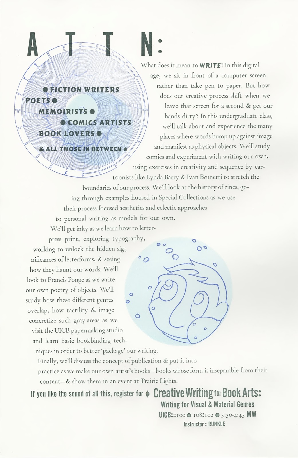
I'm really excited to teach a class at the UI Center for the Book this Spring: Creative Writing for Book Arts: Writing for Visual & Material Genres. The interdisciplinary class is for both writers and visual artists, and asks how material and visual forms present, comment on, and/or merge with textual content. In what ways do we balance readability and individual expression when writing and designing published forms? The class will emphasize tactility and mark making, looking at literature as a physical process, as well as a material product. It will explore a variety of book-related genres and media, including broadsides, chapbooks, concrete poetry, comics, zines, and artist’s books.


Above is a poster I letterpress printed to promote the class. I used craft foam, a scratch-negative photopolymer plate, a found copperplate block, and metal type (see the lockup below, thanks to Pamela Olson!).


Monday, November 4, 2013

The Iowa Working Group Archives

I've been working on archives for the Iowa Working Group. The IWG has now hosted a year's worth of book-art-focused presentations followed by casual discussion, and I wanted to make sure they were documented. Check out the latest entry for October: Candice Wuehle and Patrick Reed's The Sacrebleu Defense, which was a performative excerpt variation from their in-progress chapbook. The next IWG meeting will take place Friday, Nov 15, and will feature sneak previews from Iowa students who plan on presenting at the upcoming College Book Art Association conference. To find out more details, sign up for the IWG listserv by emailing iowaworkinggroup at gmail dot com.

Sunday, July 21, 2013

More Artist Book Sketches: Pedestrianica

I made more artist book sketches by incorporating a Baudrillard quote into two different book structures (to learn more about this Artist Book class assignment, read this post). 


I was in the middle of returning to my Letter from Pedestrianica posts, working to adapt them into an essay that, because of the way a pedestrian interacts with a cityscape, seemed apt to take place in an artist book format. The Baudrillard quote—"When your driver's license goes, so does your identity"—was in my notebook and haunting me, and I figured playing around with it would help me understand the physical shape this essay might take.


In both books I used yellow-orange—one of my favorite colorsappropriate because of its yield-sign solidarity, convenient because it meant I could utilize recycled manila envelopes. In both sketches, I used old RUNX TALES drawings of my face to represent the identity a driver's license photo attempts to capture. The paradox in both sketches is that, as the reader moves through them, the face becomes less obscured—in the first, through transitioning from the pedestrian icon's head to a more detailed face (before ending in a festive image of violence); in the second, through the subtraction of strips of paper.


I'm still thinking about how these structures and concepts could be worked into a book designed to contain (and interact with) a longer essay. 

Wednesday, July 17, 2013

Artist Book Sketches: Olive Moore

I took a class in Artist Books this last semester with Julie Leonard at the UI Center for the Book, and one of our assignments was to make a series of 3D "sketches". The sketches involved selecting a simple folded form and combining it with a quote of our choice, so that the structure and text inform one another. I picked a line from the novel Spleen by Olive Moore: "And it all began, thought Ruth idiotically, it all began when we gave up eating grass." I placed the text within the structure so as to play with the word began, and tried to embody the tension between carnality and vegetation by collaging plastic wrap, parchment-colored human anatomy diagrams, shredded paper, and blood-red aquarium rocks.


Moore chose her pen name because she said she wanted her books to be like olives: an acquired taste that once acquired, would leave the reader wanting more. After learning this, it was hard not to think of the aquarium rocks as little pimientos. Check back soon for moore artist book sketches!